Watch the Right Market
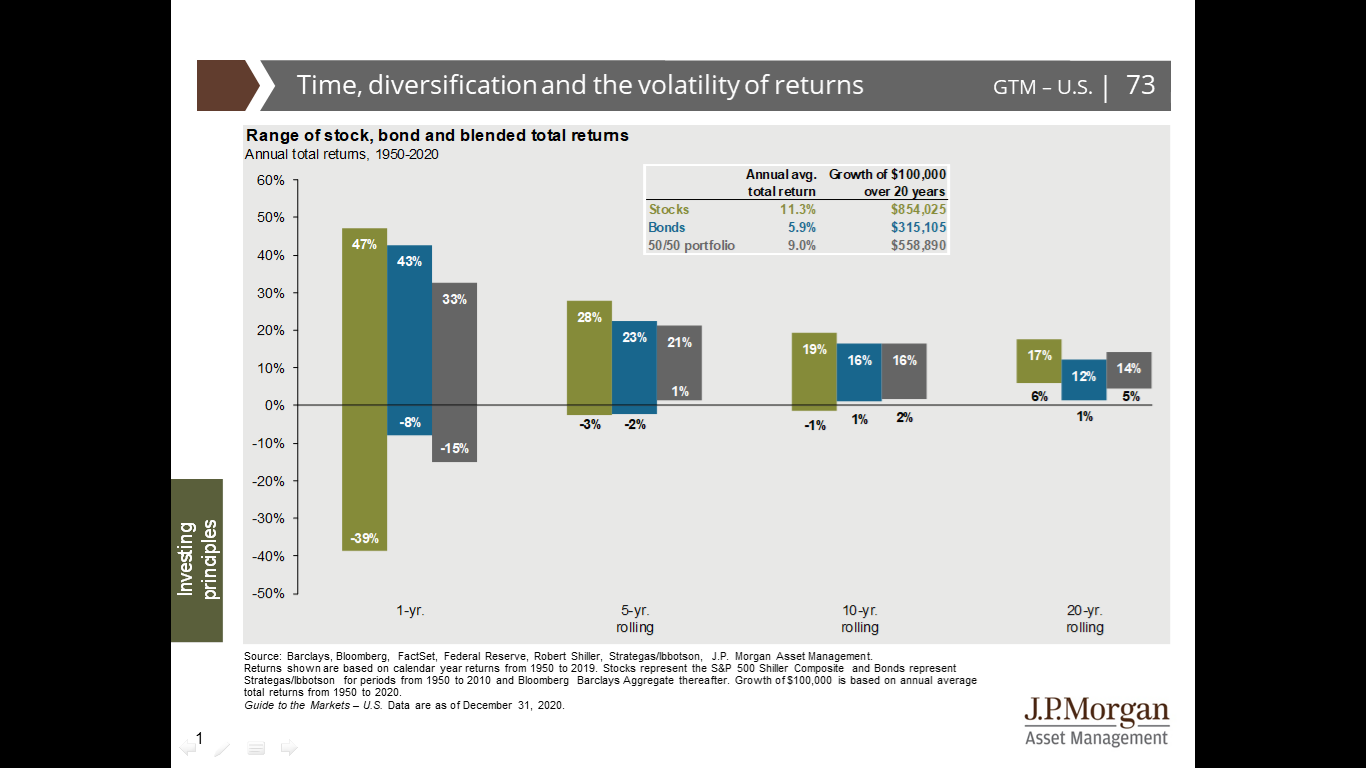
This is a blog I’ve wanted to have for a while now. The chart above shows average returns for various asset classes over a period of time. As you can see, the longer the time frame, the smaller the columns get. This means the range of returns narrows.
Here’s where it matters to us. Part of our job is helping clients make decisions about how to invest their money in order to reach their goals. An early conversation about investing will often include a discussion about “the market” and the potential direction of a particular part of that market. This conversation is heavily influenced by the left side of the chart. That’s where the financial press finds stories. If there is volatility in the returns, that means there may be a way to turn that into a story, “Stock A has unexpectedly gone down, or up. Stock B has done the opposite!” That’s where the drama comes from.
Here’s the trick. Our clients live on the right side of the chart. Once you extend the time horizon, the returns are much more predictable. There is no real drama left when you look at the 20 year return pattern. Don’t assume that the “Market” that is being discussed in the media is the “Market” that is relevant to you.
If you know someone that you think would enjoy this occasional notes, send this to them would you please? Many thanks.
No Responses