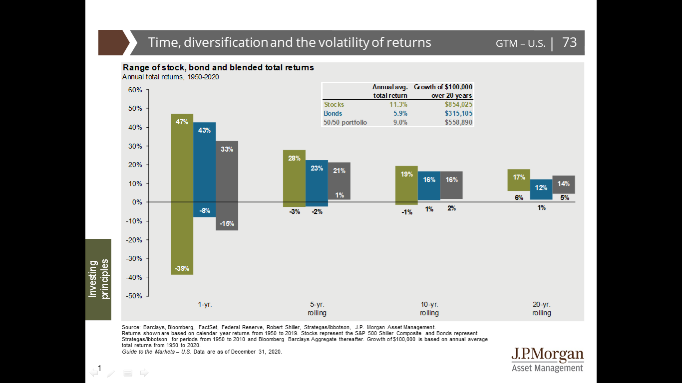
This is a blog I’ve wanted to have for a while now. The chart above shows average returns for various asset classes over a period of time. As you can see, the longer the time frame, the smaller the columns get. This means the range of returns narrows.
Here’s where it matters to us. Part of our job is helping clients make decisions about how to invest their money in order to reach their goals. An early conversation about investing will often include a discussion about “the market” and the potential direction of a particular part of that market. This conversation is heavily influenced by the left side of the chart. That’s where the financial press finds stories. If there is volatility in the returns, that means there may be a way to turn that into a story, “Stock A has unexpectedly gone down, or up. Stock B has done the opposite!” That’s where the drama comes from.
Over the past six months, markets have marched higher almost uninterrupted since the lows back in March, just as the economy was thrown into the deepest recession since the Great Depression. Many investors find this disconnect between the equity market and the economy perplexing and are constantly asking us: is it justified?
The media often interchange the economy and the stock market: when the economy is booming we would expect stocks to behave similarly. This seems logical given U.S companies are based, operate and sell in the U.S. and economic growth impacts company revenue and profits. Likewise, when the economy is in a recession or recovering (as it is now) we would expect stock market movements to mirror (or at the very least be highly correlated) to that changing economic conditions. However, simply taking these assumptions at face value reflects substitution bias.
Substitution bias is the very natural and normal tendency to take mental shortcuts in trying to arrive at a complicated answer, which sometimes leaves us without a complete understanding of the problem itself. Luckily, by leveraging data, checking across sources and, most importantly, being open to a more complex discussion can help in getting around this bias.
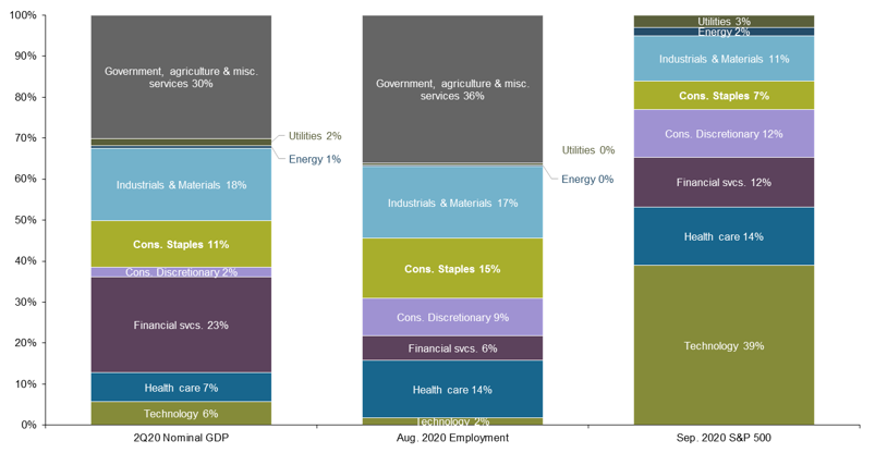
While it is always hard to fully attribute where market gains and losses emanate from, we can point out that the economy and the stock market are not in fact 1 to 1 in the U.S. As shown, the composition of the equity market is heavily weighted to technology at 39%, which has done extremely well during this time, yet only 2% of total payroll jobs (Chart 1). Going deeper into the service sector, the industries most impacted by COVID-19 (including retail, hotels and tourism, transportation, entertainment, and restaurants) represent 20% of all payroll jobs and 19% of GDP, yet these same industries only represent about 7% of S&P 500 earnings.
In summary, while the stock market and the economy are linked, they have drastically different compositions, which can lead to the economy and markets appearing to be on different wavelengths. By yielding to substitution bias, investors may think the market rally is not justified, but a deep look under the surface suggests that in fact, it is.